

這篇筆記:把我送出批改的三篇長條圖(6、6.5、7.5 分)原文並排,說明為什麼 Overview 寫對了 TA 還是 5 分,附改寫示範與檢查清單。
✦ 這篇筆記帶你看
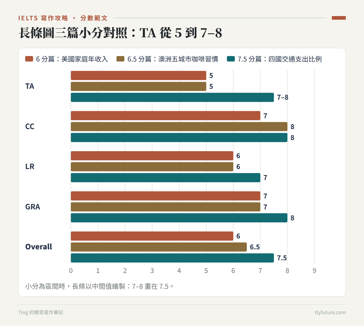
這三篇長條圖剛好是我密集練習一個月的頭、中、尾:第一篇寫在 2024/05/26,總分 6;第二篇 06/01,總分 6.5;第三篇 06/29,總分 7.5,是我這批作文裡小作文最高分的一篇。
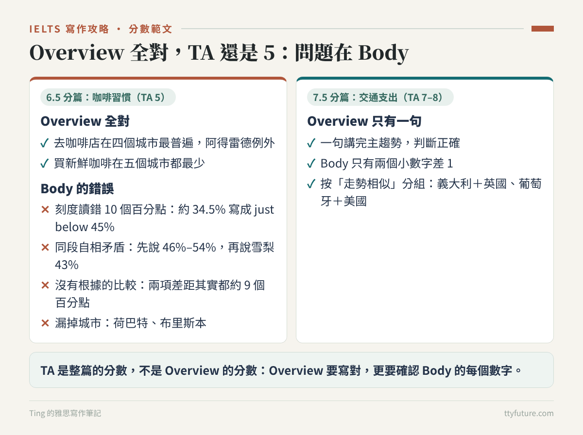
看到前兩篇 Task Achievement(TA)只有 5 分,直覺會以為是 Overview 出了問題,因為大家都說「沒有 Overview,TA 最多 5 分」。但重新對照圖表之後發現,這兩篇的 Overview 其實大致正確,尤其是咖啡那篇,Overview 一句都沒錯。真正的問題在 Body:刻度讀錯 10 個百分點、同一段裡數字自相矛盾、類別名稱寫錯、整個城市被漏掉。
這是長條圖最容易踩的坑。長條圖不像圓餅圖把數字標在圖上,你要自己對刻度估讀;長條又多,很容易看錯排、漏一根。TA 看的是整篇對圖的描述是否準確、完整,不是只看 Overview。下面三篇原文都原封不動貼出,保留錯字與文法錯誤;分數原因是我自己對照 IELTS 公開評分標準(band descriptors)的分析。
一、先看結論:三篇長條圖差在哪
| 比較項目 | 6 分篇(TA 5) | 6.5 分篇(TA 5) | 7.5 分篇(TA 7–8) |
|---|---|---|---|
| Overview | 有寫排名,沒寫變化 | 完全正確 | 主趨勢正確清楚 |
| 數字準確度 | 多處差 1–2 百萬,年份打錯 | 刻度讀錯 10 個百分點,同段自相矛盾 | 只有兩個小數字差 1 |
| 類別名稱 | 「少於 25,000」寫成「25,000」 | 正確 | 正確 |
| 涵蓋度 | 五組都有寫 | 兩個城市在某些項目被漏掉 | 四國、四個年份全部寫到 |
| 比較的說法 | kept increasing 接在下降後面,邏輯不通 | 宣稱某項差距較小,但其實一樣大 | 按「走勢相似」分組,比較有根據 |
對照評分標準,TA 5 的特徵是:關鍵特徵有提到,但涵蓋得不充分,而且描述可能不準確。很多人只記得「沒 Overview 就 5 分」,卻忽略了後半句——Body 錯得夠多,一樣是 5 分。
二、6 分篇:美國家庭年收入分布(TA 5)
題目在考什麼
這題出自劍橋 18 Test 2,我寫在 2024/05/26,原文沒有記時間,正文大約 220 字。圖表是美國 2007、2011、2015 三個年份,按年收入分成五組的家庭數量(單位:百萬戶)。五組分別是:少於 25,000 美元、25,000–49,999、50,000–74,999、75,000–99,999、100,000 以上。
| 收入組 | 2007 | 2011 | 2015 | 特徵 |
|---|---|---|---|---|
| 少於 $25,000 | 約 25 | 約 29 | 約 28 | 2011 年上升,之後小降 |
| $25,000–49,999 | 約 27 | 約 30 | 約 28.5 | 同上,2011 年是五組最多 |
| $50,000–74,999 | 約 21 | 約 21 | 約 21 | 三年幾乎不變 |
| $75,000–99,999 | 約 14.5 | 約 14 | 約 15 | 三年都最少 |
| $100,000 以上 | 約 29.5 | 約 28 | 約 33 | 2007、2015 年最多;2011 年小降,之後大幅上升 |
這張圖的關鍵:最高收入組在 2007 和 2015 年都是最多的,但 2011 年被兩個最低收入組超過;兩個低收入組 2011 年增加、2015 年小降;中間兩組相對穩定,75,000–99,999 一直最少。
分數卡
原文
以下為送出批改的原始版本,未修改(錯字、文法錯誤都保留)。
The bar chart illustrates the comparisons regarding the household annual income in US over the years 2007, 2011, and 2015. Overall, it is clear to see that households with more than $100,000 annual income were higher than all the other groups except 2011. In contrast, households in $75,000-$99,999 salary group were the least in all sample years.
As regards households in less than $74,999, both of households in $25,000 and $25,000-$49,999 income group showed a similar trend. Starting at 25m and 26m respectively in 2007, both of them grew in 2011, with 29m and 30m respectively. By 2015, they had decreased slight to roughly 27m and 28m in 2015. Regarding households which earn between $50,000 and $74,999, households with income around $50,000-$74,999 were essentially constant in all three years, with the number in the range between roughly 20.5 millions and 21 millions.
With regard to households above $75,000, the figure for households earn around $75,000-$99,999 began at nearly 14.5m in 2017, dipped slightly to 14m in 2011 and then recovered, finishing the period at 15m in 2015. Additionally, as for the households earned more than $100,000, starting with the biggest income group with approximately 29m in 2007, the number witnessed the downward trend to nearly 27m in 2011 and kept increasing considerably to the level of about 33m by 2015.
這篇為什麼拿到 6 分
Task Achievement 5:Overview 只寫排名,Body 數字和類別多處不準。Overview 寫 households with more than $100,000 annual income were higher than all the other groups except 2011、households in $75,000-$99,999 salary group were the least in all sample years,兩句都對。但它只講了「誰最多、誰最少」,沒有講這張圖最值得說的變化:最高收入組 2015 年大幅增加、兩個低收入組 2011 年增加。這是一張有三個年份的圖,Overview 完全不提時間變化,就少了一半的重點。
Body 的問題則是累積型的,一個一個看都不大,加起來就讓數據變得不可靠:
| 原文寫的 | 圖上大約 | 問題 |
|---|---|---|
| households in $25,000 | 少於 $25,000 | 類別名稱錯,讀者會以為是「剛好 25,000」 |
| $25,000–49,999 組 2007 年 26m | 約 27 | 差 1 百萬 |
| 兩個低收入組 2015 年 roughly 27m and 28m | 約 28 和 28.5 | 都偏低 |
| began at nearly 14.5m in 2017 | 2007 年 | 年份打錯,圖上沒有 2017 |
| 最高收入組 2011 年 nearly 27m | 約 28 | 差 1 百萬 |
| witnessed the downward trend … and kept increasing considerably | 先降後升 | 前面在降,後面不能說 kept increasing |
另外,開頭 the comparisons regarding the household annual income 把題目改寫成「家庭年收入的比較」,但這張圖比的是「各收入組有多少戶」,不是收入多少。這個改寫從第一句就讓考官覺得我沒有抓準圖表在量什麼。Overview 的 households … were higher 也是同樣的問題:家庭不會「比較高」,是家庭數量比較多。
Coherence & Cohesion 7:分段合理,但有重複和邏輯斷點。把五組分成「75,000 以下」和「75,000 以上」兩段,是合理的分法。扣分的地方是第二段 Regarding households which earn between $50,000 and $74,999, households with income around $50,000-$74,999 were essentially constant,同一個類別在一句裡講兩次;第三段 kept increasing 跟前文矛盾。
Lexical Resource 6:類別的稱呼方式太少、不精準。這篇 LR 是 6,是三篇裡最低的。原因很具體:五個收入組,我反覆用 households in …、households with income around …、households earn around …、salary group 來稱呼,其中 around 用在一個區間上不精準,salary 也不等於 income。長條圖的類別往往名字很長,能不能用多種準確的方式指稱類別(例如 the lowest-income bracket、households earning between … and …、the top income group),本身就是 LR 的考點。另外還有 decreased slight(應為 slightly)、the downward trend(應為 a downward trend)。
Grammatical Range & Accuracy 7:有分詞構句、關係子句,錯誤主要是 households earn around … 少了 -ing 或 who、20.5 millions 多了 s。
三、6.5 分篇:澳洲五城市的咖啡習慣(TA 5、CC 8)
題目在考什麼
這題出自劍橋 15 Test 1,我寫在 2024/06/01,原文記錄用時 21 分鐘(15:55–16:16)、196 字。圖表是一份問卷結果:澳洲五個城市(雪梨、墨爾本、布里斯本、阿得雷德、荷巴特)的居民,在過去四週內「買過新鮮咖啡」「買過即溶咖啡」「去咖啡店喝咖啡或茶」的百分比。注意縱軸是從 20% 開始,不是從 0。
| 城市 | 買新鮮咖啡 | 買即溶咖啡 | 去咖啡店 |
|---|---|---|---|
| 雪梨 | 約 43.5% | 約 45.5% | 約 61% |
| 墨爾本 | 約 42% | 約 48.5% | 約 63.5% |
| 布里斯本 | 約 34.5% | 約 53% | 約 55.5% |
| 阿得雷德 | 約 34.5% | 約 50% | 約 49.5% |
| 荷巴特 | 約 38.5% | 約 54.5% | 約 63% |
關鍵特徵:去咖啡店在四個城市最普遍,阿得雷德例外(即溶咖啡略高);買新鮮咖啡在五個城市都最少。還有一個很有意思的對比:雪梨和墨爾本買新鮮咖啡的比例最高,買即溶咖啡的比例卻最低,幾乎跟其他城市相反。
分數卡
原文
以下為送出批改的原始版本,未修改(錯字、文法錯誤都保留)。
The bar chart illustrates the results of a questionnaire concerning people’s habit of purchasing and drinking in five Australian cities. Overall, went to a cafe is a most common habit in all cities except Adelaide. In contrast, the least popular habit is buying fresh coffee in all selected cities.
Regarding people who bought fresh coffee, the highest and second highest percentage go to Sydney and Melbourne, accounting for approximately 44% and 42%, respectively. As for Brisbane and Adelaide, the proportions are almost the same; both of them make up just below 45% of the total.
Moving to people who bought instant coffee, with a variation between roughly 46% and 54%, the percentage gap between each city is not as big as the other two results. Compared with the data in all five cities, Hobert has the biggest ratio at nearly 54%, while Sydney contributes the smallest percentage with about 43%.
As for people who went to a cafe in last 4 weeks, more than three-fifths of residents in Sydney, Melbourne, and Hobart do so, constituting around 61% to 64%. Conversely, with just below 50%, Adelaide is the only city which less than half of residents went to a cafe last month.
這篇為什麼拿到 6.5 分
Task Achievement 5:Overview 全對,但 Body 有讀錯、矛盾和遺漏。這篇是最好的反例:Overview 的兩個判斷——去咖啡店除了阿得雷德之外最普遍、買新鮮咖啡在所有城市最少——完全正確,CC 還拿到 8 分。但 TA 只有 5,原因全部在 Body:
- 刻度讀錯 10 個百分點。As for Brisbane and Adelaide … both of them make up just below 45% of the total:這兩個城市買新鮮咖啡的比例大約 34.5%,應該是 just below 35%。如果真的是 45%,它們就比雪梨、墨爾本還高了,跟前一句的排名直接矛盾。這張圖縱軸從 20% 開始,格線每 5% 一條,很容易數錯一格。
- 同一段數字自相矛盾。即溶咖啡那段先說 a variation between roughly 46% and 54%,下一句又說雪梨 about 43%,43 不在 46–54 之間。實際上雪梨大約 45.5%。
- 沒有根據的比較。the percentage gap between each city is not as big as the other two results:即溶咖啡五城市差距大約 9 個百分點(45.5–54.5),新鮮咖啡也大約 9 個(34.5–43.5),並沒有比較小。
- 漏掉城市。新鮮咖啡那段沒提荷巴特(約 38.5%),去咖啡店那段沒提布里斯本(約 55.5%)。Overview 說阿得雷德是例外,但 Body 從頭到尾沒說阿得雷德最多的是哪一項。
- 把問卷百分比當成圓餅圖。make up … of the total、contributes the smallest percentage:這些是「佔整體多少」的說法,但這張圖每個城市每一項都是獨立的百分比,三項加起來不是 100%。
這幾點對照評分標準,就是「呈現了關鍵特徵但涵蓋不充分、細節不準確」。一篇 196 字的作文,有一個 10 個百分點的讀錯、一個自相矛盾、一個錯誤比較、兩個城市遺漏,即使 Overview 全對,TA 也很難超過 5。
Coherence & Cohesion 8:結構是這篇最強的地方。三種習慣各一段,段內都是先講最高、再講最低的城市,讀者很好跟。Regarding、Moving to、As for 每段一個,沒有過度;more than three-fifths of residents … do so 用 do so 代替重複的動詞,是很自然的指涉。這也說明 CC 和 TA 是分開評的:結構再清楚,內容不準一樣扣 TA。
Lexical Resource 6:扣分集中在用字錯誤和搭配:Hobert 拼錯(同一篇另一處又拼對了)、went to a cafe is a most common habit(應為 going to a café was the most common habit)、contributes 用在問卷比例上不恰當、開頭 habit of purchasing and drinking 少了受詞(買什麼、喝什麼)。
Grammatical Range & Accuracy 7:問卷是過去四週的事,應該用過去式,但文中 is、go to、make up、has 等現在式和 bought、went 混用;the only city which less than half of residents went to a cafe 應該是 in which。
四、7.5 分篇:四國政府交通支出比例
題目在考什麼
這題是網路上找的練習題,我寫在 2024/06/29,原文沒有記時間,正文大約 200 字。圖表是義大利、葡萄牙、英國、美國四國,1990、1995、2000、2005 年政府支出中用在道路與交通的百分比,每個國家四根長條。(圖上國名寫的是 Italia,所以我照用。)
| 國家 | 1990 | 1995 | 2000 | 2005 | 走勢 |
|---|---|---|---|---|---|
| 義大利 | 約 22% | 約 20% | 約 23.5% | 約 19% | 降、升、降,整體下降 |
| 葡萄牙 | 約 27% | 約 24% | 約 22.5% | 約 20% | 穩定下降 |
| 英國 | 約 10% | 約 9% | 約 12% | 約 8% | 降、升、降,整體下降(形狀跟義大利一樣) |
| 美國 | 約 11% | 約 10% | 約 13.5% | 約 15% | 1995 年小降後持續上升,唯一上升 |
分數卡
原文
以下為送出批改的原始版本,未修改(錯字、文法錯誤都保留)。
The bar chart compares how the percentage of government spending changed over a period of fifteen years in four nations. Overall, the proportion of the authorities’ expenditure on transport decreased in Italia, Portugal, and the UK, while that in the USA witnessed an upward trend.
Regarding the data in Italia and the UK, both fluctuated during the time frame. Beginning with roughly 22% and 10%, respectively, in 1990, the figure for Italia and the UK both dropped slightly in 1995 but peaked in 2000, with Italia reached nearly 23.5% and the UK reached approximately 13%. However, the proportion of the UK was far fewer than that of Italia; in 2005, the former was at about 7% while the latter was at roughly 19%.
In contrast, as for the statistics in Portugal and the USA, the trends were totally different. Starting at about 27% in 1990, spending in Portugal dropped steadily in the following fifteen years, ending up at 20% in 2005. As for the USA, the figure began with nearly 11% in 1990; after that, it dipped to 10% in 1995 and recovered to approximately 14% in 2000 and kept increasing, finishing the period at 15% in 2005.
這篇為什麼拿到 7.5 分
Task Achievement 7–8:Overview 一句講完主趨勢,Body 數字幾乎全對。Overview the proportion of the authorities’ expenditure on transport decreased in Italia, Portugal, and the UK, while that in the USA witnessed an upward trend 直接點出「三降一升」,而且美國這個例外被清楚標出來。Body 裡四國、四個年份的數字都有交代,誤差只有兩處:英國 2000 年我寫 approximately 13%,實際約 12%;英國 2005 年寫 about 7%,實際約 8%。跟前兩篇比,準確度是完全不同的等級。
這篇真正的亮點是分組方式。按數值大小分組的話,直覺會是「義大利+葡萄牙」(比例高)和「英國+美國」(比例低)。但我把義大利和英國放一起,因為它們的形狀一樣:1995 降、2000 升到最高、2005 降到最低;葡萄牙和美國放一起,因為它們都是「單一方向」,一個穩定下降、一個持續上升。這種分組讓每段都有一個清楚的主題句,也讓 Overview 的「三降一升」有了更細的層次。
離 TA 9 還差什麼?第一,Overview 可以再加一句規模的比較:義大利和葡萄牙的比例大約是英國、美國的兩倍。第二,有一個排名變化沒寫:2000 年義大利(約 23.5%)超過了葡萄牙(約 22.5%),是四個年份中唯一一次葡萄牙不是第一。第三,英國那兩個小數字可以更準。
Coherence & Cohesion 8:兩段 Body 各有清楚的主題句(both fluctuated during the time frame、the trends were totally different),段內用 the former / the latter、However、As for the USA 串連,指涉清楚。
Lexical Resource 7:authorities’ expenditure、over a period of fifteen years、dipped、recovered、finishing the period at 都恰當,改寫題目也有變化。扣分的是 far fewer,比例要用 far lower / much smaller,fewer 只能接可數名詞。
Grammatical Range & Accuracy 8:這是三篇裡文法最好的一篇:分詞構句(Beginning with …、Starting at …)、with 獨立結構、分號連接的對比句都用得穩。少數錯誤如 with Italia reached(應為 reaching),不影響整體的高準確度。
五、三篇並排比較:為什麼 Overview 對了還不夠
1. TA 是整篇的分數,不是 Overview 的分數
咖啡那篇是最清楚的證據:Overview 全對,TA 還是 5。反過來看交通支出那篇,Overview 也只有一句,卻拿到 7–8,因為 Body 幾乎沒有錯。所以準備長條圖時,Overview 要寫對,但更要花時間確認 Body 的每個數字。
2. 長條圖最常見的三種讀圖錯誤
| 錯誤類型 | 這三篇的例子 | 怎麼預防 |
|---|---|---|
| 縱軸不是從 0 開始 | 咖啡那篇 34.5% 讀成 45% | 下筆前先看縱軸起點和格線間距 |
| 長條太多,看錯排 | 收入那篇兩組的數字都偏差 1 | 用尺或筆桿對齊長條頂端再讀 |
| 遺漏某一根 | 咖啡那篇漏掉荷巴特、布里斯本 | 寫完後在圖上逐根打勾 |
3. 分組要有理由
| 分組依據 | 適合的情況 | 例子 |
|---|---|---|
| 按數值高低 | 高的一群、低的一群差距明顯 | 收入那篇:75,000 以下/以上 |
| 按項目(每個圖例一段) | 圖例 3 個左右,每項的城市排名不同 | 咖啡那篇:三種習慣各一段 |
| 按走勢形狀 | 有時間軸,而且不同對象的走勢有相似處 | 交通支出那篇:先降後升再降一組,單向變化一組 |
三種都可以拿高分,關鍵是分組後每段要有一句說明「為什麼它們放在一起」。交通支出那篇每段第一句都在做這件事,收入那篇只有 As regards households in less than $74,999 這種說明範圍的開頭,沒有說明這幾組有什麼共通點。
4. 一個月的進步,主要在準確度
從 5 月 26 日的 TA 5 到 6 月 29 日的 TA 7–8,三篇的模板其實差不多,句型也沒有變得特別華麗。差別在於最後一篇的數字幾乎都對、類別名稱都準確、每個國家每個年份都有交代。換句話說,長條圖要拿高分,不是學更多高級字,而是把讀圖這件事做得更仔細。
六、改寫示範:把咖啡習慣那篇的 Overview 和 Body 重寫
我選咖啡那篇示範,因為它最能說明「Overview 對了,Body 也要對」。以下標註「改寫示範」,是這次整理時新寫的版本。
改寫示範|開頭+Overview
The bar chart shows the results of a survey on the proportions of residents in five Australian cities who bought fresh or instant coffee, or went to a café for coffee or tea, in the previous four weeks.
Overall, going to a café was the most common habit in four of the five cities, the exception being Adelaide, where buying instant coffee was marginally more popular. Buying fresh coffee was the least common habit everywhere, although it was noticeably more widespread in Sydney and Melbourne than in the other three cities.
改了什麼:開頭把三種習慣和「過去四週」都講出來,不再只寫 purchasing and drinking。Overview 保留原本正確的兩個判斷,但把阿得雷德的例外說清楚(即溶咖啡略高),並加上一個新的重點:新鮮咖啡在雪梨和墨爾本明顯比較多。時態統一用過去式。
改寫示範|Body 1(兩種購買習慣)
Looking first at buying habits, the proportion of residents who bought fresh coffee ranged from about 35% to 44%. Sydney and Melbourne had the highest figures, at roughly 44% and 42% respectively, while Brisbane and Adelaide had the lowest, at around 35% each, with Hobart in between at nearly 39%. The pattern for instant coffee was almost the reverse: Hobart and Brisbane recorded the highest rates, at about 54% and 53%, whereas Sydney had the lowest, at approximately 45%, followed by Melbourne at under 49%.
改了什麼:第一,34.5% 改回正確的 around 35%,雪梨的即溶咖啡改成約 45%,前後不再矛盾。第二,五個城市在兩種習慣裡都有出現,原本漏掉的荷巴特補上了。第三,刪掉「差距比較小」這種沒有根據的比較,換成真正存在的特徵:兩種咖啡的城市排名幾乎相反。第四,不用 of the total、contributes,改用 the proportion of residents who …,符合問卷資料的性質。
另一段 Body 寫去咖啡店:墨爾本、荷巴特、雪梨都超過六成(約 63.5%、63%、61%),布里斯本約 55.5%,阿得雷德不到一半(約 49.5%),而且是唯一一個去咖啡店比買即溶咖啡(約 50%)還少一點的城市。這樣 Overview 說的「阿得雷德例外」在 Body 就有了數字佐證。
七、長條圖可以直接帶走的句型與檢查清單
指稱類別的多種說法(以收入組為例)
| 說法 | 例句骨架 |
|---|---|
| 區間 | households earning between $50,000 and $74,999 |
| 最高/最低組 | the highest-income group / the lowest-income bracket |
| 少於/以上 | households with an income of less than $25,000 / of $100,000 or more |
| 簡稱(第二次提到時) | the top bracket / the two lowest groups / the middle category |
長條圖常用句型
| 用途 | 句型骨架 | 注意 |
|---|---|---|
| 範圍 | The figure ranged from about [x]% in A to [y]% in B. | 比列舉五個數字省字 |
| 排名相反 | The pattern for B was almost the reverse: … | 長條圖很常見的亮點 |
| 例外 | …, the exception being A, where … | Overview 好用 |
| 形狀相同 | A and B followed a similar pattern, dipping in … before peaking in …. | 按走勢分組時的主題句 |
| 規模比較 | The figures for A and B were roughly double those for C and D. | Overview 第二句很適合 |
| 先降後升 | A dipped to [x] in … before rising sharply to [y]. | 不要寫 kept increasing |
✓ 自我檢查清單
- ☐ 下筆前先看縱軸:從幾開始?每條格線代表多少?
- ☐ 開頭改寫題目時,確認圖表在量什麼(家庭數量?百分比?金額?)
- ☐ 類別名稱照圖例寫準:less than、or more、between … and … 都不能省
- ☐ 每個對象、每個項目在 Body 裡至少出現一次(寫完逐根打勾)
- ☐ 同一段裡的範圍和個別數字沒有互相矛盾
- ☐ 每個比較句(差距比較大、比較小)都能在圖上找到證據
- ☐ 問卷、獨立百分比不要用 of the total、contribute
- ☐ 時態一致:過去的年份、過去的問卷用過去式
練習
- 把收入那篇的 Overview 改寫成「排名+變化」的兩句版本:一句講最高、最低組,一句講 2011 和 2015 年的變化。
- 把交通支出那篇的 Overview 加上一句規模比較,練習 roughly double 的句型。
- 找一張縱軸不是從 0 開始的長條圖,先只做一件事:把每根長條的數值估出來寫在旁邊,再跟答案或同學比對,看看自己的讀圖誤差有多大。
長條圖看起來規矩、好寫,但它考的是耐心。我這三篇的分數變化,幾乎可以直接對應到數字的準確度。如果你的 TA 一直卡在 5 或 6,先別急著換模板,拿一篇舊作文,對著圖把每個數字重新核對一次,答案常常就在裡面。
延伸閱讀
IELTS 寫作攻略導覽 · 分數範文(第 2 / 19 篇)
← 上一篇:6 · 7|折線圖:差在趨勢有沒有讀對
下一篇 →:6.5 · 7|圓餅圖:差在 Overview 說得清不清楚
✦ Target Your Future
有些日子,明明練了很久,成績卻還停在原地。希望這篇筆記能讓你知道,備考路上遇到挫折並不孤單。一次次重聽的錄音、改過的作文、終於敢說出口的句子,都是你已經走過的路。
把這些經驗寫下來,是想陪下一個正在準備的人少繞一點路。你不必照著我的方法前進,只需要慢慢找到適合自己的節奏。累的時候可以休息,再回來做今天能完成的一小步。
願你最後帶走的,不只是成績單上的數字,還有更相信自己、敢往世界走近一點的勇氣。
— Ting
← 回到 IELTS 備考筆記
Leave a Reply